


Great news for today! The Global Plant Council and Plants, People, Planet are delighted to announce the two winners of our #PlantSciVid competition.
We received 15 brilliant entries and although some of them were submitted a (tiny) bit late, all were accepted for consideration in the competition. We decided to allow some flexibility given the current global situation (pandemic, lockdowns, and levels of quarantines). After carefully considering all of the entries, we are delighted to announce the following winners.
The winner in the ‘SciComm’ category is Gabriela Doria (@gabidoria), a Colombian botanist and paleobotanist interested in the evolution and diversification of plants at different time scales. Gabriela’s clear video effectively communicates how she uses morphological, molecular, and ecological approaches to address questions on flower development, pollination biology, systematic affinities of fossil plants, and phenotypic variation of living and fossil plants in response to environmental changes. She is currently a PhD student in the Department of Plant Sciences at Cambridge University (UK).
The winner in the ‘Plant Health’ category is Ilaria Martino (@_chapeau13_), an Italian PhD Student at Agroinnova (Torino, Italy), where she is working on developing a plant pathogen isolation method. Her video was creatively shot and very well put together, with the researcher as the main focus while the different stages of the plant pathogen isolation and determination method were portrayed. Excellent!
In addition to the board of directors of The Global Plant Council, which acted as the judging panel, the editorial and communications team at Plants, People, Planet were also impressed by the quality of the videos submitted to the competition, and the breadth of research communicated. You can watch more of the submissions in the playlist below. What is clear from these videos is the variety of ways in which plant science is of great importance for the wellbeing of people, and the planet that we call home. We were very pleased to see the creativity employed in communicating these concepts. Congratulations to the winners, Gabriela and Ilaria, and very well done to all of the entrants.
To watch all contributions you may watch the full playlist on Youtube, or you may visit the partial lists created on Twitter or Instagram.
Plants, People, Planet is an Open Access journal that aims to promote outstanding plant-based research in its broadest sense and to celebrate everything new, innovative, and exciting in plant sciences that is relevant to society and people’s daily lives. The journal is owned by the New Phytologist Trust, a not-for-profit organisation focused on the promotion and advancement of plant science. Find out more.
The Global Plant Council is a coalition of 28 national, regional, and international organizations representing plant, crop, agricultural, and environmental sciences across the globe. GPC aim is to promote plant science across borders & disciplines, supporting those involved in research, education, and training, and to increase awareness of plant research in science and society. Find out more.

Re-published with permission from John Innes Centre. Thank you to James Piercy for sharing.
‘Science is not finished until it is communicated’, so said Sir Mark Walport, former medical scientist and the Chief Executive of the UK Research and Innovation (UKRI). Unsurprisingly, being in the Communications and Engagement team, we agree with Sir Walport, and there are a number of ways that science can and is communicated. We can do:
Another vital method for peer-to-peer communication is at scientific conferences. Hordes of scientists from a particular field, come together to showcase their latest research and to learn about the work of their peers, collaborators or competitors.
Alongside the oral presentations, or talks, a key way to communicate the latest research and results is through ‘poster sessions’. Here scientists, of all levels in their careers, present their latest discovery on a sheet paper or fabric, pinned to a board.
Poster sessions provide an ideal opportunity for peer-to-peer learning and should be an excellent experience for presenter and viewer.
As a presenter, this is a captive audience. There are large numbers of people who are interested in your field of research and they are all there to learn. They want to get their fill of new methods, exciting initial results and network with like-minded people from all over the world.
There is a burgeoning grass roots initiative led by Psychology PhD student Mike Morrison, that believes that one of the reasons for this is that the posters on display at these sessions aren’t designed in the optimal way for the environment and context they’re used in. In other words, the audience posters are created for aren’t given the information contained within them, in a way that allows them to access it.
User-centred design is the process of considering how an object will, or needs to be, used and designing it accordingly. For example, think of a door which can only open in one direction. From one side the door needs to be pulled and from the other pushed. Effective user design of that door, would mean that on the pull side of the door there is a handle, allowing the user to pull open the door and on the other side, no handle but a flat plate.
A pull handle works perfectly on the side of the door which needs to be pulled but hinders the user on the push side. The handle implies that the user should pull the door, potentially walking into it, before realising it doesn’t open in that direction and then pushing the door.
Why? Because a handle suggests to the user that door needs to be pulled and thus influences the user’s behaviour. Wasted time and potential (minor) injury, all because of poor user design.
The same principles of considering how something will be used and then designing accordingly can be used for anything from doors to websites. It is here that Mike’s push to apply these principles to scientific posters comes in and his video (above) is well worth investing 20 minutes of your time.
When Mike, was first asked to make a scientific poster he thought the reason most academic posters look the way they do is because they have to. However, he soon learned that there were no rules for academic poster design enshrined into academic lore and realised there was a huge opportunity to improve the way research is communicated.
The first thing is to change the way posters are designed and put together, making them quicker and easier to create, which is great for the presenter.
We can also make them better at conveying the key information, by considering what the purpose of the poster is; i.e. what is it trying to tell people?
An ideal academic poster should accomplish three goals;
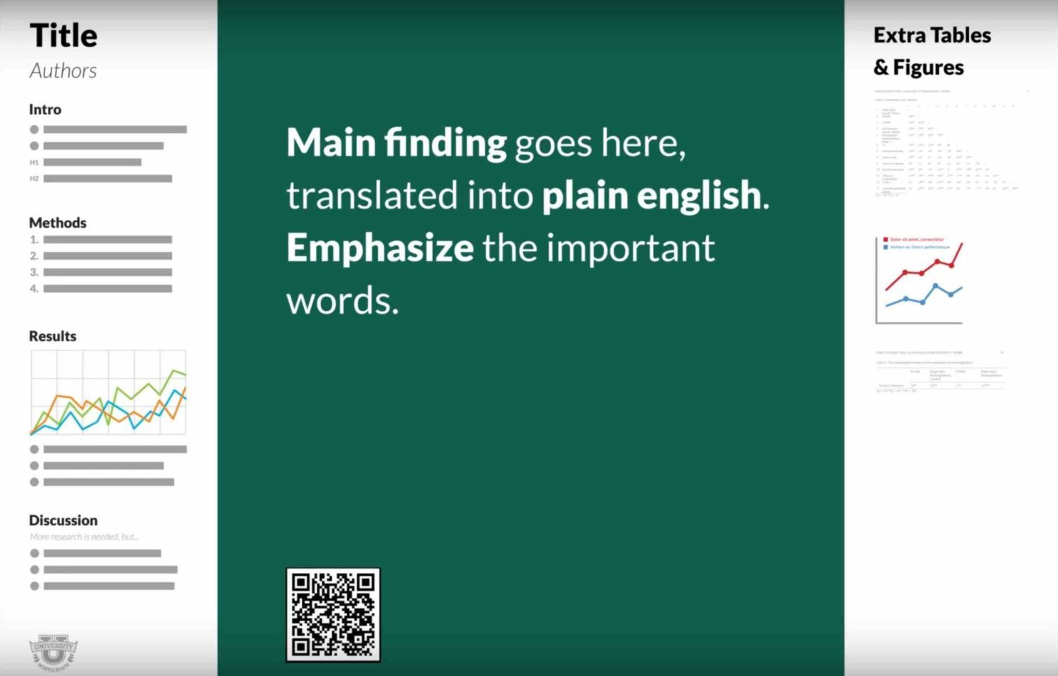
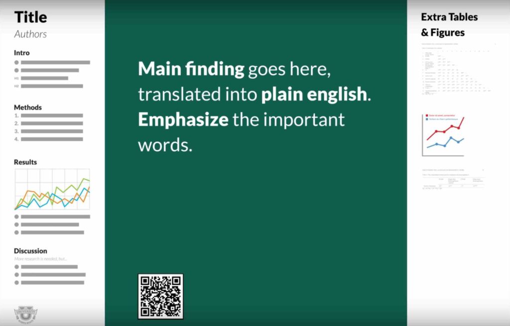
To do this, consider a completely blank page and think; “if I could only put one thing on here, what would it be?” The answer is probably, the main finding of the study, because what you found is the most interesting and most relevant thing you want to tell people.
So, you need a finding, or take-home message, to be placed prominently in the front-and-centre, where it is easy to read and cannot be missed. The next step is to take that finding, and without changing the meaning, word it in such a way that it is both easy to understand and memorable.
For example, Mike found the following finding hidden away in the ‘Discussion’ section of one poster, which he then changed into Plain English;
To;
A good way to do this is to think of billboards which are designed to transmit information to people passing by them. As such, they provide a good starting point for scientific posters, which are essentially trying to do the same thing. Only our posters are ‘selling’ the research findings/methods/techniques, rather than a product.
However, while that is the key take home message, a good academic poster needs to do more than just announce the headline, because behind every headline is the story.
For that, Mike suggests a bar on the side of the poster on which you will normally stand, called an ‘ammo box’, which features all the data (tables, graphs etc) that back up the headline and which you would refer to, in order to answer any questions that arise from people who talk to you about your poster.
On the other side of the page, Mike suggests another bar, named ‘the silent presenter’ in which you add the sections that appear on almost all scientific posters, but slimmed down and formatted in a way to be easily consumed; i.e. in bullet points. It is in this bar that you would add; the question you started with, your collaborators, an introduction, the methods, results and discussions. This space can be used to provide people an overview of the study, assuming they will be reading it silently, in three or four minutes, rather than 10.
The side bars are a key part of the proposed new template, because they allow you to include all the information which appeared on the old design but arranged in a way that is optimised according to how they are used.
With the design simplified, there is room to provide a source for the full study for people who are intrigued by your headline and would like to know more, but don’t have time to talk or read your ‘silent presenter’ bar.
In a digital age, 99% of conference attendees will have a smart phone, which can read QR codes. A QR code is easy to create and can be added to a poster so that anyone can photograph it and find the full study, or further information online, quickly, easily and without needing to interact with you at all. Using QR codes allows you to include even more information than a traditional poster allowed for, but in a format that saves time, cognitive effort and in much less space.
All of this taken together allows each person who sees your poster to take exactly the level of information away from it they want, from just the headline finding, through to digesting the full research paper.
Finally, another good tip we were given on our facebook account by Katia Hougaard is to include a stack of business cards with your poster, so that people could take your contact information with them and contact you later.
By following Mike’s advice, together we can design better scientific posters and improve the rate of scientific progress.
This is not to say that you have to use the layout Mike suggests, but we recommend trying to create a poster that teaches attendees something as they walk by, instead of relying on them to stop and talk to you, in order to learn about your work.


The more specific climate scientists are about the uncertainties of global warming, the more the American public trusts their predictions, according to new research by Stanford scholars.
But scientists may want to tread carefully when talking about their predictions, the researchers say, because that trust falters when scientists acknowledge that other unknown factors could come into play.
In a study in Nature Climate Change, researchers examined how Americans respond to climate scientists’ predictions about sea level rise. They found that when climate scientists include best-case and worst-case case scenarios in their statements, the American public is more trusting and accepting of their statements. But those messages may backfire when scientists also acknowledge they do not know exactly how climate change will unfold.
“Scientists who acknowledge that their predictions of the future cannot be exactly precise and instead acknowledge a likely range of possible futures may bolster their credibility and increase acceptance of their findings by non-experts,” said Jon Krosnick, a Stanford professor of communication and of political science and a co-author on the paper. “But these gains may be nullified when scientists acknowledge that no matter how confidently they can make predictions about some specific change in the future, the full extent of the consequences of those predictions cannot be quantified.”
Predicting the future always comes with uncertainty, and climate scientists routinely recognize limitations in their predictions, note the researchers.
“In the context of global warming specifically, scientific uncertainty has been of great interest, in part because of concerted efforts by so-called ‘merchants of doubt’ to minimize public concern about the issue by explicitly labeling the science as ‘uncertain,’” said Lauren Howe, who was a postdoctoral scholar at Stanford when she conducted the research with Krosnick and is first author on the paper.
“We thought that, especially in this critical context, it was important to understand whether expressing uncertainty would undermine persuasion, or whether the general public might instead recognize that the study of the future has to involve uncertainty and trust predictions where that uncertainty is openly acknowledged more than those where it is minimized,”
Howe said.
To better understand how the public reacts to scientists’ messages about the uncertainties of climate change, the researchers presented a nationally representative sample of 1,174 American adults with a scientific statement about anticipated sea level rise.
Respondents were randomly assigned to read either a prediction of the most likely amount of future sea level rise; a prediction plus a worst-case scenario; or a robust prediction with worst-case and best-case scenarios, for example: “Scientists believe that, during the next 100 years, global warming will cause the surface of the oceans around the world to rise about 4 feet. However, sea level could rise as little as 1 foot, or it could rise by as much as 7 feet.”
The researchers found that when predictions included a best-case and worst-case scenario, it increased the number of participants who reported high trust in scientists by 7.9 percentage points compared with participants who only read a most likely estimate of sea level rise.
Changes in environmental policies, human activities, new technologies and natural disasters make it difficult for climate scientists to quantify the long-term impact of a specific change – which scientists often acknowledge in their predictions, the researchers said. They wanted to know if providing such well-intended, additional context and acknowledging complete uncertainty would help or hurt public confidence in scientific findings.
To find out, the researchers asked half of their respondents to read a second statement acknowledging that the full extent of likely future damage of sea level rise cannot be measured because of other forces, such as storm surge: “Storm surge could make the impacts of sea level rise worse in unpredictable ways.”
The researchers found that this statement eliminated the persuasive power of the scientists’ messages. When scientists acknowledged that storm surge makes the impact of sea level rise unpredictable, it decreased the number of participants who reported high trust in scientists by 4.9 percentage points compared with the participants who only read a most likely estimate of sea level rise.
The findings held true regardless of education levels and political party affiliation.
Not all expressions of uncertainty are equal, Howe said: “Scientists may want to carefully weigh which forms of uncertainty they discuss with the public. For example, scientists could highlight uncertainty that has predictable bounds without overwhelming the public with the discussion of factors involving uncertainty that can’t be quantified.”
Read the paper: Nature Climate Change
Article source: Stanford University
Author: Melissa De Witte
Image credit: Jody Davis / Pixabay